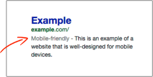
They’re calling it mobilegeddon, but some call it mobilepocalyse. That was the date when Google released its mobile-friendly algorithm to give an advantage in mobile search results to those sites that can pass its Mobile-Friendly Test. Here is an excerpt from Google
“Starting April 21, 2015, Google Search will be expanding its use of mobile-friendliness as a ranking signal. This change will affect mobile searches in all languages worldwide and will have a significant impact in Google Search results. “
Sites that pass this test get a Google mobile friendly tag when their site shows up in search results.
Note that this only affects mobile searches. 
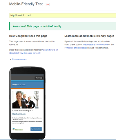
Here is the Google Mobile-Friendly Test:
https://www.google.ca/webmasters/tools/mobile-friendly/

If your site passes this test, you are rewarded with a green tag containing the message,“Awesome! This page is mobile friendly.”
This test is connected to another test called Page Speed Insights: https://developers.google.com/speed/pagespeed/insights/
To pass the test, you need a score of about 80% on both Page Speed and User Experience for Mobile. Also note that your webpage has to be mobile friendly for a minimum width of 375px, not 320px, to pass this test. And it might even pass for 480px or more if your score in other aspects is high enough to give you an average of 80%.
If it’s a newer site, it’s much easier to make it mobile friendly. Older sites can be a bit more challenging. This blog post has some helpful tips for retrofitting older sites that might use floats, legacy code, or tables for layout.
What to keep in mind:
1- the goal is to make it mobile friendly for at least 375px wide
2- it’s best to view your mobile optimized site on Google Chrome for this test if you’re viewing it on a desktop. You can always adjust it later for other browsers.
5 main checkpoints that you’ll need to watch out for:
- Incompatible Plugins – avoid using Flash and the kinds of plugins that most mobile browsers don’t support. YouTube Videos are fine. More about that below.
- Content Wider Than Screen – try to make your content fit within the viewport for mobile users, so there is no horizontal scroll
- Links Too Close Together – make your links and buttons large enough for mobile users to press
- Text Too Small To Read – make your font big enough for mobile users to read
- Mobile Viewport Not Set – specify a viewport for your webpage, or make sure it adapts to different devices
Set Mobile Viewport – HTML
Some sites are considered mobile friendly even without their viewport set, because their text is large enough, and the page doesn’t need horizontal scrolling.
But this is pretty easy to add to your webpage, in the head section. Here is the line of HTML code to add. It is preferable to use the first one:
<meta name="viewport" content="width=device-width, initial-scale=1.0" />
or
<meta name="viewport" content="width=device-width" />
How to update your CSS stylesheet for mobile:
Assuming that you have a div id=”wrapper”, and it has a min width of 980px for desktop. Then what you might add to your CSS stylesheet could look something like this. Explanation below:
@media only screen and (min-width:980px){
#mobile {display:none;}
#desktop {display:block;}
}
@media only screen and (max-width:979px){ html, body {font-size: 16px;} #wrapper {width:100%; max-width:100%; min-width:375px;} #mobile {display:block;} #desktop {display:none;} .sidebar {float: none;} img, input {max-width:100%; height:auto;} a {word-wrap:break-word; padding:0 10px;} table {max-width:100%;} ul#menu {max-width:100%; margin:0 auto;} #menu li {display:block;text-align:center;} .video-container {position:relative; padding-bottom:75%; padding-top:35px; height:0; overflow:hidden;} .video-container iframe {position:absolute; top:0; left:0; width:100%; max-width:420px; height:100%; max-height:315px;} }
EXPLANATION
Uses Incompatible Plugins – CSS
This is the code for YouTube Videos. You could give them a class=”video-container”. Then in your CSS stylesheet:
.video-container {position:relative; padding-bottom:75%; padding-top:35px; height:0; overflow:hidden;}
.video-container iframe {position:absolute; top:0; left:0; width:100%; max-width:420px; height:100%; max-height:315px;}
For other plugins that aren’t supported, you could try an image replacement. Then give the unsupported plugin an id=”desktop”, and the image replacement an id=”mobile”.
@media only screen and (min-width:980px){
#mobile {display:none;}
#desktop {display:block; }
}
@media only screen and (max-width:979px){ #mobile {display:block;} #desktop {display:none; } }
Text too Small to Read – CSS
Font size 16px is what Google recommends for a baseline.
html, body {font-size: 16px;}
Links Too Close Together – CSS
Another problem you might have in addition to links that are too close together, is links that are so long, they force the page to be wider than it should be. The following CSS code addresses both problems:
a {word-wrap:break-word; padding:0 10px;}
Content Wider Than Screen – CSS
Images can sometimes be too large for the viewport. So can input fields for forms and searches. Here is a line of CSS code that can handle both problems:
img, input {max-width:100%; height:auto;}
Tables used for data and Tables used for layout
table {max-width:100%;}What about tables used for layout?
You could either remove the widths, give them CSS classes, change px widths to percentages, or use this neat trick. Say for a table with a fixed width of 500px (HTML):
<table style="display:block; max-width:500px;">
Floats
Assuming that you have a sidebar (class=”sidebar”) with a float, then this is what you would add:
.sidebar {float:none;}Menus
Assuming that you have a horizontal menu with an id=”menu”. Then
ul#menu {max-width:100%; margin:0 auto;}
#menu li {display:block; text-align:center;}
In Conclusion – CSS
Again, putting it all together and assuming that you have a horizontal menu with the id=”menu”, a sidebar (class=”sidebar”) with a float, then this is what you might add to your CSS stylesheet. Of course, you would have to modify it for your particular site, but basically:
@media only screen and (min-width:980px){
#mobile {display:none;}
#desktop {display:block; }
}
@media only screen and (max-width:979px){ #mobile {display:block;} #desktop {display:none; } html, body {font-size:16px;} #wrapper { width:100%; max-width:100%; min-width:375px; } img, input { max-width:100%; height:auto; } a {word-wrap: break-word; padding:0 10px;} .sidebar {float: none;} table {max-width:100%;} ul#menu {max-width:100%; margin:0 auto;} #menu li {display:block;text-align:center;} .video-container {position:relative;padding-bottom:75%;padding-top:35px;height:0;overflow:hidden;} .video-container iframe {position:absolute;top:0;left:0;width:100%;max-width:420px;height:100%;max-height:315px;} }
Final Check
Tried to cover all the bases, but there might still be some elements that stick out from the viewport, stretching the page to make it wider than it should be and making horizontal scrolling necessary. Just do a final check to see if you missed anything.
Hope some of this helps 🙂 Let us know by commenting below..
Leave a Reply